Database Design and Visualization about Covid, Vaccination, Temperature and Economic
Other Visualization
(Other Visualization Dash Website link: https://dashapp-oidifediiq-uk.a.run.app/
Access to the dash link has been temporarily suspended due to budgetary limitations.)
Correlation Heatmap:
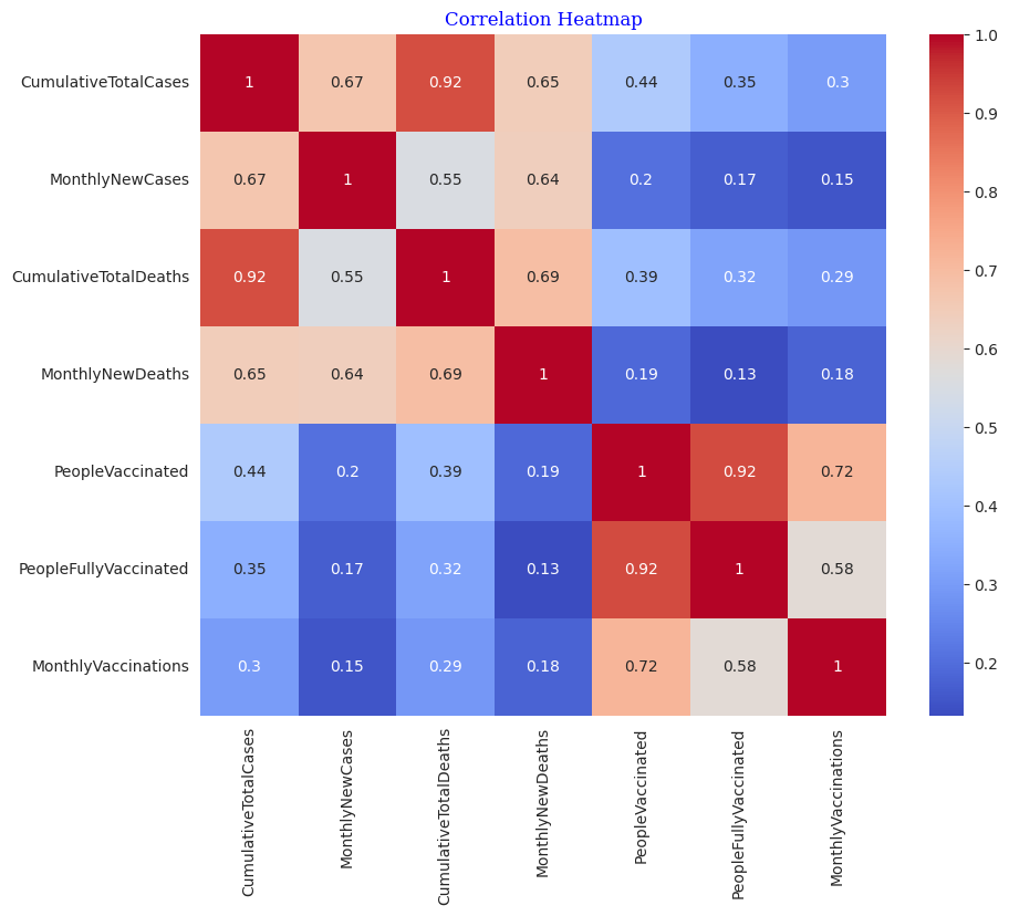 CumulativeTotalCases and CumulativeTotalDeaths ; people vaccine and people fully vaccine , the two pairs seem to have the most correlation, which is 0.92, much larger than 0.8.
Rugplot:
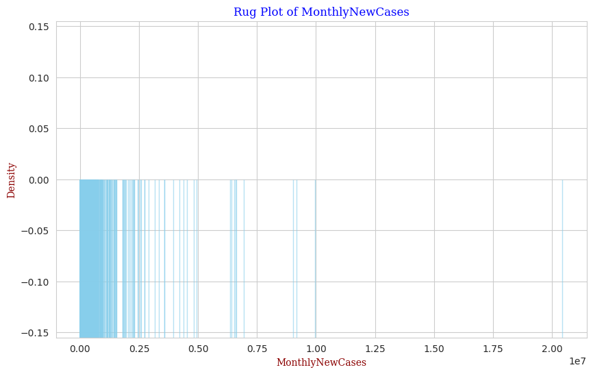 It seems that most cases distribute in 0~0.125e7
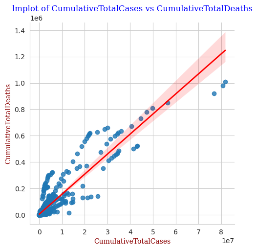
Implot:
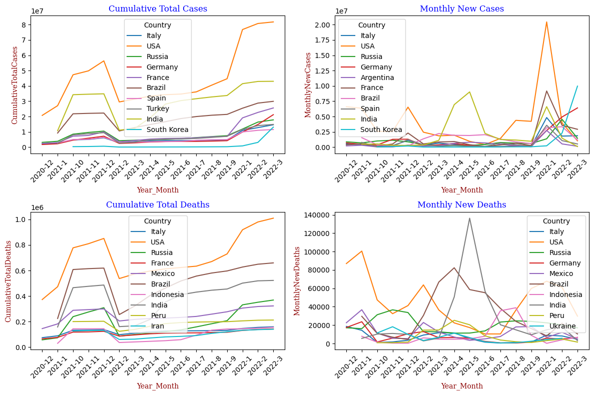
Lineplot:
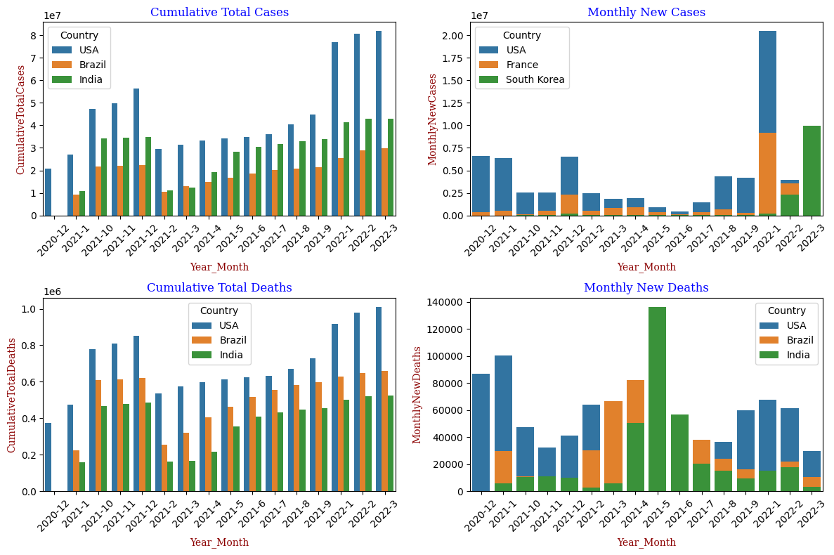
Barplot: